A logo is rarely seen in one perfect place. It shows up as a tiny app icon, a social profile circle, a website header, a slide deck corner, a shipping label, and sometimes a giant event backdrop. That is why more brands are shifting from “the logo” to a logo system: a set of logo versions plus clear rules for how they adapt across real-life touchpoints.
This also links closely to globalisation. When your brand travels across markets, your logo must survive different languages, scripts, layouts, and cultural expectations without losing recognition. And right now, more trend roundups keep pointing to adaptive or modular logo system thinking as a key direction for 2026 branding work.
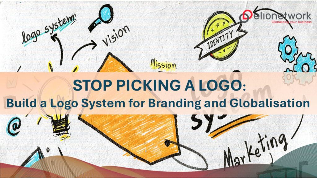
What a logo system means today
A logo system is not a “new style.” It is a practical structure that keeps your branding consistent when the format changes.
A typical logo system includes:
- A primary logo (full version for large spaces)
- A secondary logo (stacked or simplified for tighter layouts)
- An icon (for small sizes like app icons and favicons)
- Colour and single-colour versions (for printing, dark mode, and limited production)
- Rules for spacing, minimum size, and background control
- For global brands: local-language versions and bilingual lockups (so the brand name stays readable in each market)
If you only design one logo and hope it works everywhere, you usually end up with rushed “fixes” later. That is when branding gets messy: inconsistent spacing, random colours, slightly different versions across markets, and a logo that looks fine on a poster but falls apart at small sizes.
The 9 logo types to explore inside a logo system
Below are nine classic logo types. The goal is not to pick one and stop. The goal is to choose the type that fits your brand, then build the supporting versions that make the logo system work across channels and global markets.
1) Wordmark
A wordmark is the brand name as the logo. It is often the clearest route for newer brands or trust-heavy sectors, because it avoids confusion.
For globalisation, wordmarks shine when you plan language versions early: for example, a Latin wordmark plus a local-script version with matching proportions and spacing.
2) Lettermark (monogram)
A lettermark uses initials. It works well when the brand name is long, or when small sizes are the main use case.
In a logo system, the lettermark often becomes the icon for social avatars and product surfaces. The risk is looking generic, so the type needs a distinctive twist.
3) Letterform (single-letter mark)
This is one letter, designed as a recognisable symbol. It is simple, quick to read, and very strong at small sizes, which makes it useful for digital-first branding.
Guidance from Apple reinforces the idea that icons must remain clear and recognisable at very small sizes, so overly detailed marks tend to fail (even if they look great on a big mockup).
4) Pictorial mark (brand symbol)
A pictorial mark is a recognisable object or symbol. It can become very powerful over time, but early on it may need support from the name.
A good logo system often starts with a combination mark (symbol + name), then gradually uses the symbol alone once recognition grows.
5) Abstract mark
Abstract marks are non-literal shapes designed to be ownable. They are popular for modern brands because they can scale into patterns, frames, and motion elements, giving you more than “just a logo.”
For globalisation, abstract marks are helpful because they do not depend on a specific language. But the meaning must still be clear enough that it does not feel random.
6) Combination mark
A combination mark pairs a symbol with the brand name. This is often the most practical choice because it supports both clarity and flexibility.
Inside a logo system, you can separate the elements: the full lockup for large placements, and the symbol alone for small ones. It is a very system-friendly format, to be honest.
7) Emblem (badge)
Emblems feel established and authoritative. They work well for institutions, communities, education, and heritage brands.
The issue in 2026 is tiny sizes. Most emblems need a simplified variant for favicons and profile images, otherwise the details blur. This is where a logo system saves you.
8) Mascot
Mascots bring warmth and personality. They can do well on social channels and in campaigns, where storytelling matters.
But mascots should not be your only answer. A strong logo system usually pairs the mascot with a simpler core mark (wordmark, lettermark, or icon) so the branding stays usable everywhere.
9) Dynamic or responsive logo system
This is the “system” type by design: a set of planned variations that respond to context, size, and channel. Many 2026 trend discussions highlight adaptive, modular, or motion-ready approaches because brands live across more formats than ever.
A dynamic system can still be consistent, as long as the rules are tight: same proportions, same spacing logic, and one or two anchor elements that never change.
How to choose the right logo system for your branding and globalisation plan
Start with where your logo must perform. If your brand lives mainly on mobile and social, prioritise an icon-first direction (letterform, lettermark, or symbol). If trust and clarity matter most, start with a wordmark or combination mark, then build the icon from it.
Next, test it like a real person will see it. Nielsen Norman Group recommends evaluating icons for recognisability and interpretation, because people do not always read symbols the way designers expect. This is also where your globalisation check matters: does the mark still feel balanced next to a different script, a longer translated name, or a bilingual lockup? Small adjustments early can save a lot of rework later, honestly.
A soft next step
If you are planning a refresh or a new identity this year, aim to leave the project with a complete logo system, not just a single “final” logo file. That is what keeps branding consistent across teams, channels, and markets as globalisation speeds up.
And if you would like a second pair of eyes, elionetwork can help you define the right logo system versions for each market, then document the rules clearly so local teams can adapt assets with confidence (and without the identity slowly drifting over time).