
 中文 (中国)
 DE
DE ES
ES FR
FR 日本語
日本語 한국어
한국어 ไทย
ไทย 中文 (台灣)
FOR IMMEDIATE RELEASE

elionetwork announced today the unveiling of its new logo design. The new logo represents a fresh and modern take on the company’s brand identity and is part of a larger effort to update the company’s visual identity system.
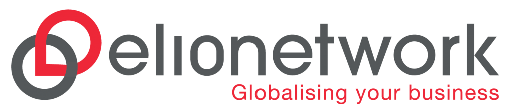
With a modern and clean design, the updated logo truly reflects elionetwork’s commitment to innovation, creativity and forward-thinking. A carefully selected colour scheme of red and grey creates an ideal balance between reliability and dynamism, perfectly embodying the values we strive to provide our clients. The colour grey is typically associated with traits such as balance, sophistication, and professionalism, which are all qualities that we aim to embody as a business. The colour red, on the other hand, is known for its associations with energy, passion, and power, all of which reflect our commitment to delivering excellent services and creating a strong emotional connection with our clients. Together, these two colours work in harmony to communicate the core values that our company stands for.
The icon of our company is created by intertwining the letters “L” and “O” to cleverly form a location pin on a globe. This imagery symbolises our ability to support clients’ business expansion efforts, wherever they may be located. It not only represents our company’s dedication to bridging the language gap and fostering unity among people, but it also signifies our enthusiasm for collaborating closely with our clients. Additionally, the discreet inclusion of the letters L10N within the logo represents our specialised expertise in the localisation industry.
“We are thrilled to unveil our new logo, which reflects our commitment to innovation and modernity” said elionetwork’s Managing Director – Melvin Quek. “As we continue to grow and expand our business, we felt it was important to update our brand identity to better reflect who we are and what we stand for.”
The new logo design will be gradually integrated into all of elionetwork’s marketing channels in the coming weeks. Clients will soon be able to see the new design on our website, social media pages, and various other platforms, helping to create a cohesive visual identity across all of our communication channels.
“We believe the new logo design will help us connect with our clients in a more meaningful way and strengthen our brand presence in the market,” said elionetwork’s Global Business Director – May Chiang.
Our team is excited to roll out the new design across all our materials and channels, and we look forward to hearing feedback from our valued clients.